Intro guide
Request
To ensure a proper onboarding process, an intro guide was required for the SaaS ETL platform. It had to provide a better understanding of the workflow's main steps, tools and options available even for the basic case scenario.
Solution
"Turning raw data into a useful chart" guide.
After shaping and analyzing a few possible customer journey maps for our platform, I chose this particular one for being the most user friendly and profitable. All the necessary parts of the workflow were created both for the guide's content and to be used as demo parts in future. For the new customers and employees that had a dedicated environment (demo or their own account), those demo parts were available to play with, following this guide.
Platform and tools used
Docs site run on a static site generator; Git, VSCode, Markdown, Mac OS image editors.
So how do you I use this magic tool of yours, you ask?
This is a brief description of the first steps that you’re about to take with our product. Please find a more in-depth description in the Workflow in details section in the menu on your left. Full info and all the details on every step are given in the corresponding sections in the same menu you see on your left. All the links here will bring you to those corresponding sections.
In your own account, you will have a few demo source Integrations to recreate all the steps described here and know JustControl.it better.
This is a basic example of a scenario that can be built in the product.
ℹ Info:
For the data source Integrations, we are using fake ones with fake data, hence those steps that involve creating an Integration and connecting it to the data source cannot be fully recreated at this point.
Moving to the scenario. Say, you need to see the overall Spend metric values for the campaigns that are running on two data sources: Facebook and TikTok.
Let’s walk through the product starting from the login-pass welcome email to the dashboard with your data visualized on it.
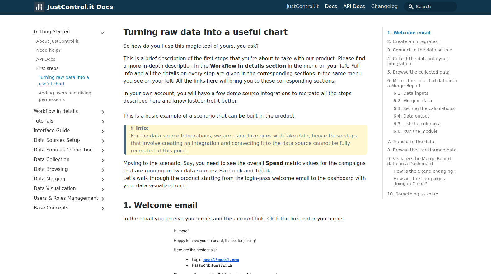
1. Welcome email
In the email you receive your creds and the account link. Click the link, enter your creds.
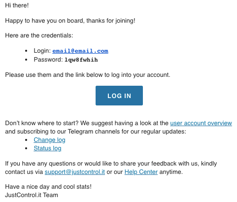
You will be redirected to the Integrations page of your account. The page is almost empty as of now, of course, showing only the demo Integrations.
To make the data appear on your Dashboards, we will have to collect it from the data sources that you use (here, TikTok and Facebook), merge it all together, cooking it the way you need, and then visualize it using our Dashboard widgets.
So let’s move on to the next step. For the data to appear in your JC.it account, it must be collected into the account’s dedicated Integration.
2. Create an Integration
You already have two demo Integrations to work with and they do not have to be connected to any data sources. But for the full workflow demonstration purposes, let’s have a look at how the actual data source module Integrations work at these very first steps.
Obviously, you can create multiple Integrations for those data source we have modules for, see the list here. Each Integration contains data collected by certain parameters on a certain schedule, all of it is initially set up at this step.
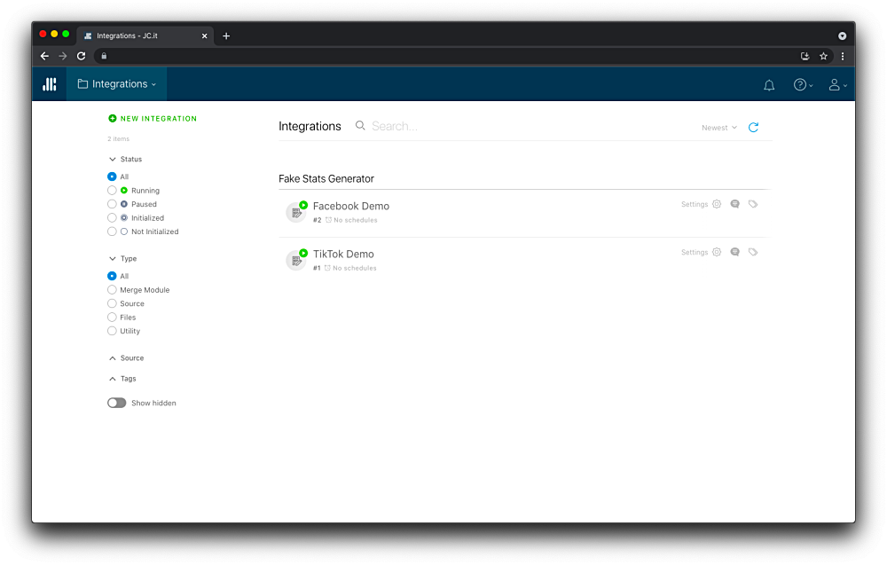
To create a new Integration, in Integrations click NEW INTEGRATION, select the data source that you want to collect your data from and enter it’s name at the second step of this flow.
The initialization log screen will appear. Wait for the Module initialized message and STOPPED status.
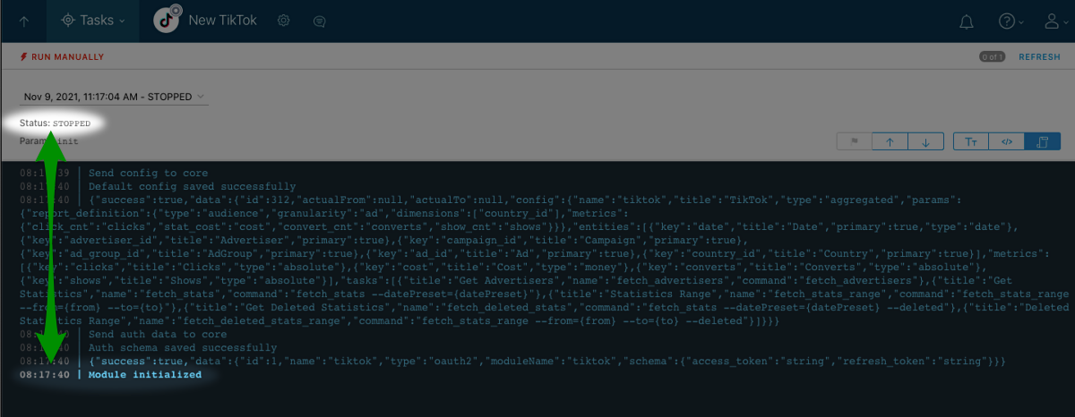
In our case that would be TikTok. Since we are using a fake one, do find it on the Integrations list and open it.
3. Connect to the data source
In order to collect the data, your TikTok Integration must have an access to your TikTok account. So this step is even simpler: connect your Integration to TikTok using your account’s creds (or tokens, or keys - different data sources use different ways of authorization).
It is done in the Integration settings sidebar, click the gear icon near the Integration’s title to open it:
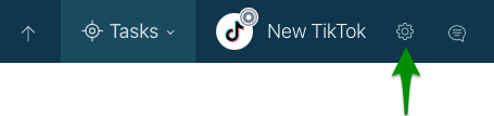
Next, click the CREATE AUTH CONNECTOR button and connect it.
4. Collect the data into your Integration
ℹ Note:
Starting from this step, you can recreate the actions on your demo Integration. We’re also using it as an example Integration in screenshots.
Once your TikTok Integration is set up and has access to your TikTok data, you can collect the latter to it.
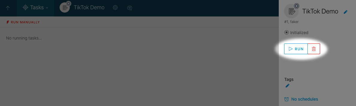
For you to do that, the Integration status must be Running, whereas currently its Initialized. Let’s run the Integration.
In its settings sidebar, click RUN and confirm the action.
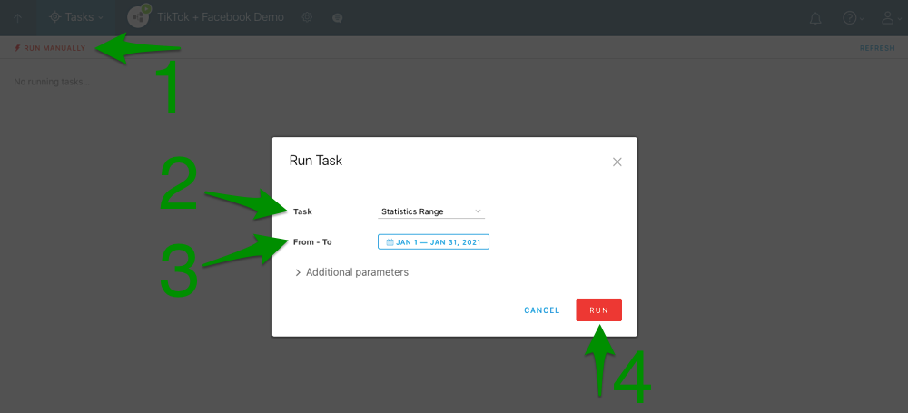
The running Integration can collect data. To do that, you have to run the corresponding Integration task on it. Click RUN MANUALLY, and set the following task run parameters:
- Task: Statistics Range
- From - To: Jan 1 - Jan 31, 2021
This is what it will look like:
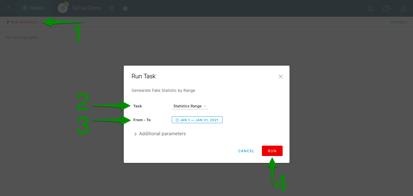
After setting them, click RUN.
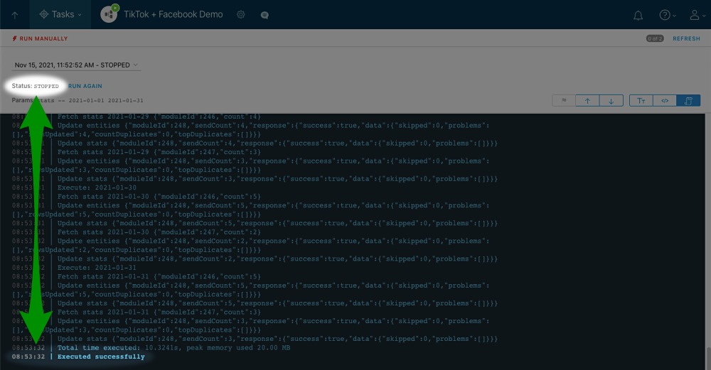
The task run log screen will appear. Wait till the status says STOPPED and log shows an Executed successfully confirmation.
ℹ Info:
That notification means a completion of any task you can run on an Integration: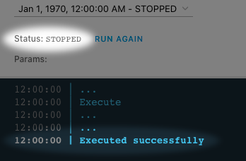
The Integration has collected your TikTok data. Now you can check the result by browsing it on a corresponding page.
ℹ Note:
After running the data collection task once, you will have the currently relevant data transferred from data source into your Integration. Surely it will be outdated soon, so in order to always have updated and relevant data, the data collection schedule will have to be set.
We’ll skip this for now and will look at it closely when giving you an in-depth workflow overview in the Workflow in details section here: Schedule the data collection.
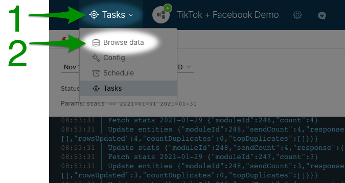
5. Browse the collected data
Now you have a TikTok Integration with your data in it. To check if the collection went fine and the data is correct, you can browse it on the Browse data page.
Upon the opening it says There is no data yet… because the data browsing parameters are not set yet.
![]()
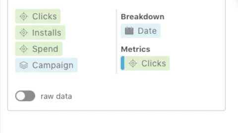
In the date range picker, select that date range that we have collected the data for: Jan 1 - Jan 31, 2021.
Next, click DATE and tick the other breakdown - CAMPAIGN - too. This way you are selecting them to be displayed. Click APPLY to apply the breakdowns selection.
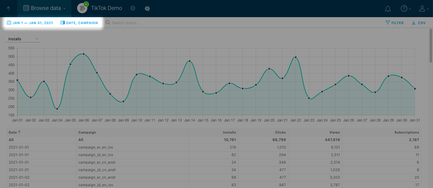
The graph can also be viewed for different metrics, click Converts above it to see the dropdown list.
So this page is a window into the TikTok Integration data. The data here is exactly the same as the data source has, nothing is being changed upon the data collection.
On this page you can browse data for different date ranges, by various breakdowns. You can also filter it using the query filter above or simply clicking the values you wish to filter the data by.
THE SECOND DATA SOURCE
To transfer the data from your second data source - Facebook - go through steps 2-5 once again, but building up a Facebook Integration this time.
Once you’re done, you’ll have two Integrations with data in them that can and will be transformed and merged into one good report.
6. Merge the collected data into a Merge Report
At this step you have two Integrations with the exact same data as the data sources have. You can browse it on their own Browse data pages and you can merge it into one good report, transforming it the way you need.
Let’s say, you need to have your Spend displayed to you and it’s calculated as Installs * 2. So you need to have the data on installs from both data sources in one place and apply a calculation formula to those numbers to have your Spend. That’s exactly the basic thing that can be done in our Merge Report.
Here we will go through a process of building a Merge Module Integration’s data transformation flow that will provide us with the desired result. We will not get too much into details though as our main goal now is to show you the basic steps.
ℹ Info:
More in-depth description of this process is given in Build a merging data flow article.
So, let’s start. To create a consolidated report, go to Integrations click NEW INTEGRATION and select Merge Module.
Next, we’ll have to build the data transformation flow.
6.1. Data inputs
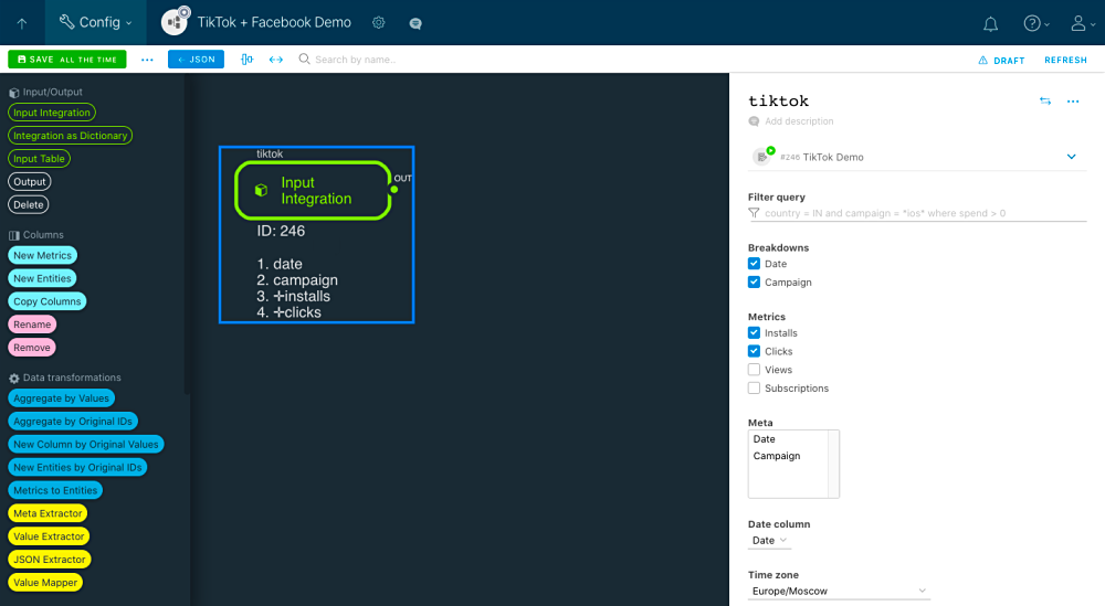
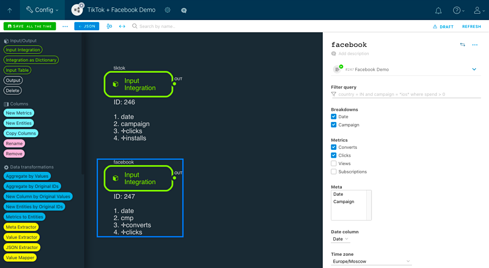
Drag&drop two Input Integration components on the workplace. Double click on one of them to open its settings. You might want to rename it to facebook. In the integrations selector, find and click the Facebook Integration that you have. Next, select the data that you want to have collected into this new Integration and set the parameters that must be applied to it (timezone, filters, etc) while it’s being transferred.
Let’s say, we need the dates, campaign names, and the data on clicks and installs to calculate the spend with.
The working area and component’s settings will look like this:
Now add another Input Integration component, select the second Integration for it and set it up the same way. We suggest naming it tiktok.
When you’re done, you will have this in front of you:
The two Integrations that you have are now added to the data flow diagram as data inputs. When the Merge Module runs, it will take the Integrations’ data and transform it in accordance with the data flow that you will create next.
6.2. Merging data
But look at the technical names of those data columns in our data sources:
| TikTok | |
|---|---|
date |
date |
campaign |
cmp |
installs |
converts |
clicks |
clicks |
☝ Important!
The data in matching columns (clicks and clicks) can be merged, whereas the data stored in the mismatching columns (campaign and cmp) cannot be merged.
See more info in the corresponding part of “Build a merging data flow” article.
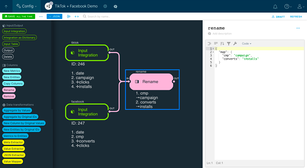
What can we do now? Right, simply rename the columns. To do that, put the Rename component on the diagram, link it to the inputs and set the renaming rules: column’s old name to column’s new name. The goal is to put same data into one column. You can use any column name, we suggest setting the component this way:
{
  "map": {
    "cmp": "campaign",
    "converts": "installs"
  }
}
This will be the picture:
At the end of this step your Merge Module knows how to create one good data table out of the two original ones.
6.3. Setting the calculations
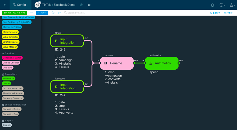
Let’s get to the Spend metrics that we need to calculate. Place the Arithmetics component on the diagram and link it to the Rename one.
This component can calculate the data you need (filters available) the way you want (using the expressions). For this basic scenario we just need it to calculate the installs*2 expression. To do that you can either put this into its code:
{
  "formulaField": "field_to_put_formula_not_required",
  "formulaDefault": "N/A",
  "targetField": "spend",
  "defaultToPort": false,
  "map": [
    {
      "expression": "installs*2"
    }
  ],
  "replace": false,
  "skipIfExists": true
}
or set it yourself in the Arithmetics Visual editor. Hint: putting the prepared code would be faster at this point :).
☝ Important!
Note the "targetField": "spend", line in the code above. It means that the component will put the calculations result into the spend column that doesn’t exist in our data table yet. We are to add it a bit later.
After setting up your Arithmetics component, you will have this:
Your Merge Module knows how to create a data table and calculate the metric for you.
6.4. Data output
Now let your Merge Module give you the results. Just place the Output component on the diagram and link it to the Arithmetics one.
Here’s your finished data flow:
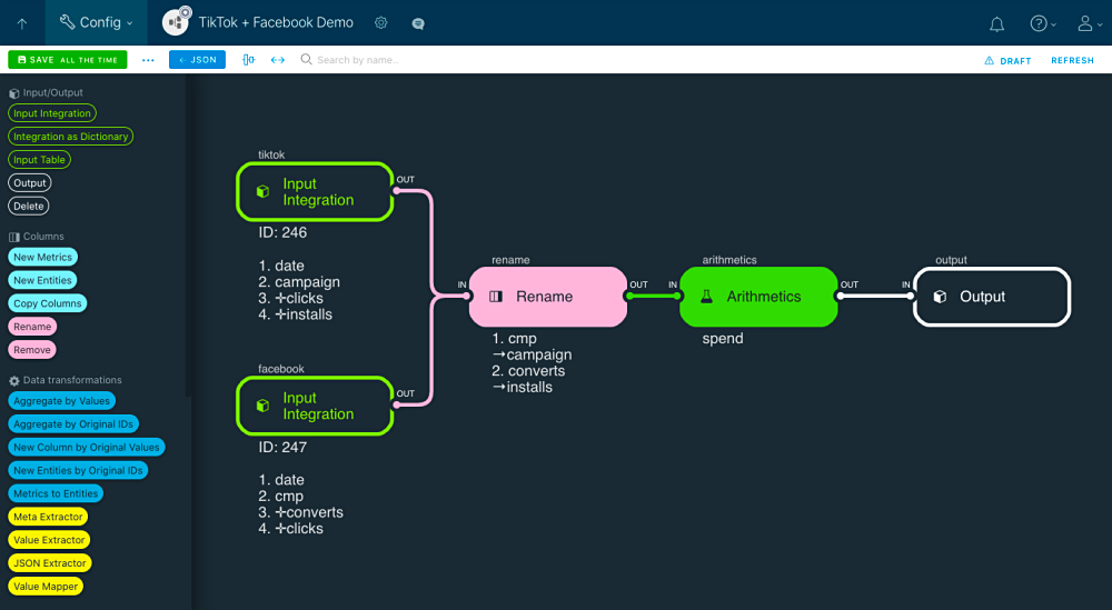
Once the Merge Module is run, having this data transformation flow it will collect data from Facebook and TikTok Integrations, transform it (rename the columns) and save into one data table for further visualizing.
6.5. List the columns
Before getting to this Merge Module’s first run, we have one more thing to set up.
And we’ll have to dig a bit deeper into the Merge Module’s JSON code. Please click the JSON button to access it.
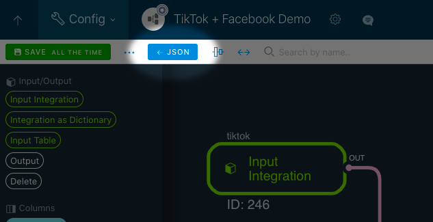
You will see the Merge Module’s JSON-code. Replace the lines 5-13 with this:
 "entities": [
    {
      "key": "date",
      "title": "Date",
      "type": "date",
      "primary": true
    },
    {
      "key": "campaign",
      "title": "Campaign"
    }
  ],
  "metrics": [
    {
      "key": "clicks",
      "title": "Clicks",
      "type": "absolute"
    },
    {
      "key": "installs",
      "title": "Installs",
      "type": "absolute"
    },
    {
      "key": "spend",
      "title": "Spend",
      "type": "absolute"
    }
  ],
This step is required to let the Merge Module know which columns to display on its Browse data page and also what attributes those statistics data fields have.
Next, click the SAVE ALL THE TIME button to save all the changes:
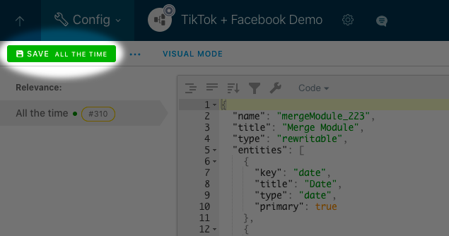
ℹ Info:
The button saying ALL THE TIME means that this config is always relevant.
If you need to calculate your Spend as Installs * 2 for Jan 1 - Jan 15 and as Installs * 20 for Jan 16 - Jan 31, another basic feature of our Merge Module will help you with this, please find more about it here: Date range relevances.
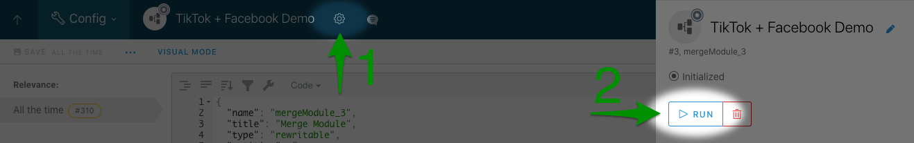
Now your Merge Module can take, transform and save the data. To do any of that, its status must be Running, whereas currently its Initialized. Let’s run the module.
6.6. Run the module
To run your Merge Module, you have to change its status. To do that, open its settings by clicking the gear icon and click RUN in the settings sidebar and then YES, RUN to confirm your action.
The module is running now and you can work with data. Let’s try collecting it from the source Integrations, transform and save.
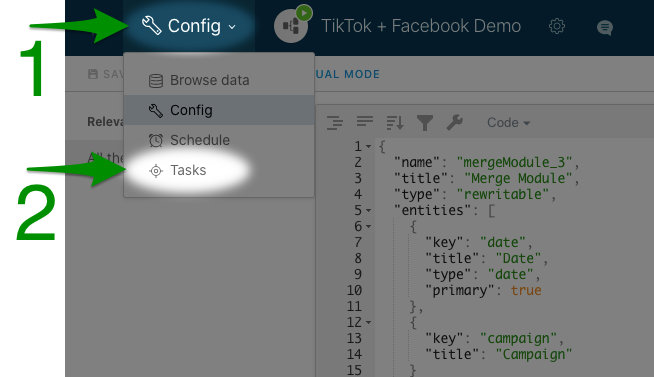
7. Transform the data
To collect, transform and save the data, you have to run the Integration task on your newly set Merge Module Integration. To do that, go to the Tasks page:
On this page, click RUN MANUALLY, and set the following task parameters:
- Task: Statistics Range
- From - To: Jan 1 - Jan 31, 2021
This is what it will look like:
After setting them, click RUN.
The task run log screen will appear. Wait till the status says STOPPED and log shows an Executed successfully confirmation.
At this point, the Merge Module has collected, transformed and saved the data. Now you can check the result by browsing the transformed data just the way you browsed the collected one.
8. Browse the transformed data
To browse the transformed data, go to Browse data page and browse the consolidated report’s data. All the data browsing features available on the source Integrations Browse data pages are also available here.
Set the date range to Jan 1 - Jan 31, 2021, then select the breakdowns: click DATE, tick the CAMPAIGN breakdown and also the APPLY button.
Take a look at the data table. The Spend column’s values are exactly the Installs * 2.
Now that you have the metric calculated, let’s move on to visualizing it.
9. Visualize the Merge Report data on a Dashboard
You can of course leave it like that and always open the Browse data page itself once you need the info and look at the numbers carefully. But it is much more useful to visualize it via various widgets on your Dashboard.
Let’s imagine that you have two goals:
- Find out how your Spend is changing with time.
- See which campaigns have the Spend over 500 and below 700 in Germany.
How is the Spend changing?
To reach the first goal, go to the Dashboards section, create a new Dashboards clicking NEW DASHBOARD and rename it to My Dashboard. On your new Dashboard, click ADD WIDGET and select Chart.
ℹ Info:
In two words, with the Chart widget you can create a pie chat, a bar chart or a line chart to visualize your metrics. With the Datagrid widget, you can, for example, highlight table cells depending on the values, tracking the changes of your metric.
Once it is added, you will see its settings on the left with only the Integrations selector available for now.
First, rename the Chart to January’21 Spend. Next, click the selector and choose your Merge Module Integration.
For the widget with selected Integrations, all the other widget settings become available.
Say, you wish to see how your Spend changes with time during January, 2021.
First, open the date range picker and select the Jan 1 - Jan 31, 2021 date range.
Then, in the Breakdowns & Metrics area with green and blue rectangles, drag&drop the green Spend one to the right column, it will appear under Metrics. This way you’re selecting it for viewing in your widget.
Next, drag&drop the other metric to the left to remove it from your widget and make sure the selected Breakdown is Date.
ℹ Info:
Green and blue rectangles represent entities and metrics data columns, find full info about those here: Entities & metrics.
Click APPLY to save the changes. This is what you will see at this step:
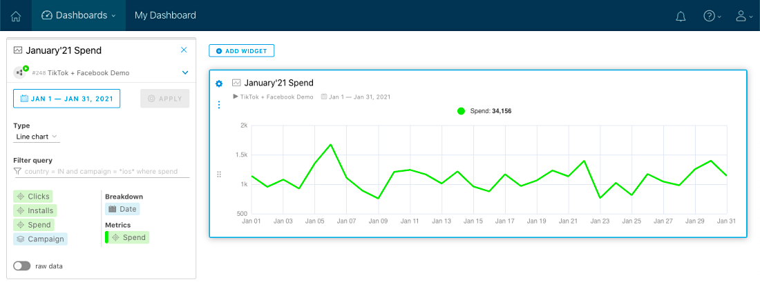
There you go! That’s your Spend metric changing with time.
How are the campaigns doing in China?
The next goal is to check out which campaigns in China have the Spend over 3400 and below 2500.
Before we start, imagine that the campaign names have de, en and cn tags in them marking the countries.
ℹ Note:
The tags can be different consisting of any other symbols and meaning something else.
To reach our goal, add the Datagrid widget to your Dashboard and, just like for the Chart widget previously and let’s call this one Campaigns. Click the Integrations selector and choose your Merge Module Integration.
Same goes for the date range: 1 - Jan 31, 2021 in the date range picker . As for the Breakdowns & Metrics area, since we want to see the data on spend by campaigns, drag&drop the Spend and Campaign rectangles to the right column and any other rectangles that might be in that column - to the left one. This in what the settings should look like:
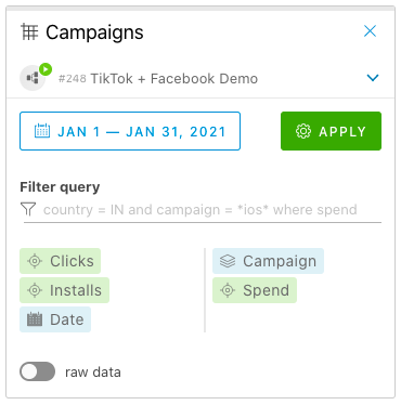
Click APPLY.
The data table will appear in the widget, containing both columns that you selected.
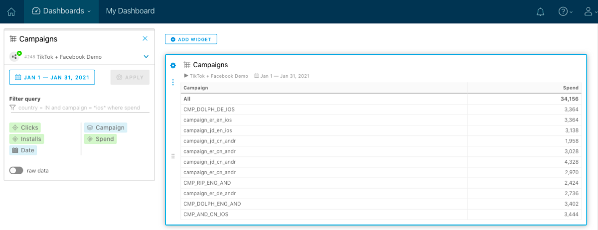
Now let’s work with that data. In the widget settings, double click the Spend rectangle to open the metric’s settings.
In the Spend settings window, fins Conditional format section and click ADD RULE.
For the first rule, select Less than and set 2500. Then add the second rule as Greater than and 3400. Don’t forget to assign them distinct colours.
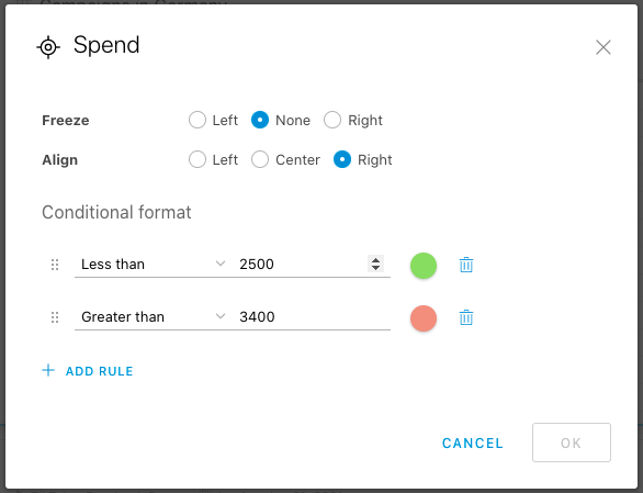
Click OK and then click APPLY to apply the changes to your widget.
Data table cells with the corresponding values will be highlighted. Now you know which campaigns are spending too much and which ones - too little, just at a glance:
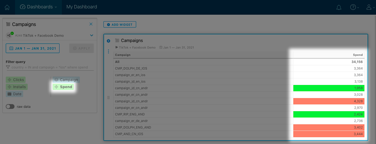
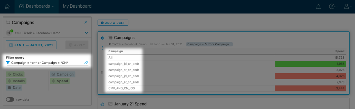
And on top of that, let’s only keep the campaigns run in China. Query filter and the cn and CN tags will help us with it: click the Filter query field, select Campaign from the dropdown list, than select the middle of the line matches option and enter cn. To take into account the CN tag, too, click the field again and select or, then repeat the previous actions but for the CN tag. Here’s what the filter query will be like: Campaign = *cn* or Campaign = *CN*. After setting it, click APPLY. The data table will change to the following:
Feel free to close the widget’s settings (cross icon in its upper right corner).
Now in this widget you have your overall spend from Facebook and TikTok filtered by the amount of money and displayed for a certain country.
And this is the very basic scenario that JustControl.it covers, we haven’t even gotten to the proper use of those naming tags and KPI metric creation etc. See the Workflow in details menu section on your left for more info.
10. Something to share
Since we are getting to know the product closer, let’s take one more step forward and prepare something for the next round.
Imagine that you need to share that info on how the campaigns are doing in Germany with an employee or a business partner of yours. Just that info, nothing more.
In two words, to do that you simply create a Dashboard with that widget only, then add a JC.it user for that person and share the Dashboard with that user.
As a preparation here we’ll create that Dashboard and place the widget on it.
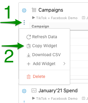
First, copy the Datagrid widget by clicking Copy Widget in the More actions button menu.
 </a>
</a>
Next, create a new dashboard by clicking the NEW DASHBOARD button and rename it to Shared dashboard. Then click ADD WIDGET and add the Campaigns widget you have copied to your new dashboard.
Now you have two dashboards:
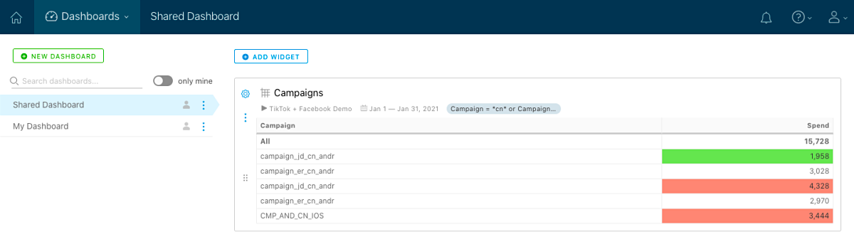
The new one can be shared to another person showing them only the info on campaigns’ spend in Germany. We’ll get to it in the Adding users and giving permission article.